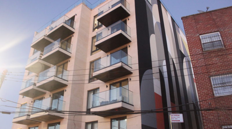
BUILDING AWARD WINNER: Astoria’s Graffiti House Reaps Reward of Risky Name
BY BENJAMIN FANG
When it comes to interior design, don’t settle, strive to do the next best thing.
That’s what motivated Jeffrey Harris, president of Voyeur Real Estate, when he designed Graffiti House on Welling Court in Astoria.
More than just a beautifully designed building, Graffiti House acts as a rotating art gallery, featuring 20 permanent installations and other original works in the lobby and hallways of every floor.
The facility is located in the heart of Astoria’s street art scene, led by the Welling Court Mural Project. A public art experience launched in 2009, the project hosts 150 murals by both renowned and upcoming artists.
Harris, whose firm was the broker and leased Graffiti House, sees the building as a “natural extension” of the project.
“There’s an interaction between the physical space, with where you live and how you live,” he said. “It’s a matter of creating a visual aspect to the building that goes beyond the actual look of the interior. It adds another layer of depth to each floor.”
Working with the Bushwick-based Ad Hoc Art, Harris and his team brought 40 artists to paint street art not only on each floor of the building, but also vertical art installations in the elevator.
“It exposes people to a medium of art that people don’t normally see. If they do, it’s normally in passing on the street,” Harris said. “This allows us to showcase that art and expose tenants and visitors to a whole new variety of artists.”
Harris also added that in addition to the Welling Court Mural Project, Socrates Sculpture Park and the Noguchi Museum are both nearby, adding to the artistic and cultural appeal of Astoria.
Though he recognizes the risk of a name like Graffiti House, which evokes thoughts of vandalism and eyesores, Harris said he has seen a tremendous response to the building. Residents have been buzzing about the art they’ve seen already.
“We knocked it out of the park,” he said.
Harris said though interior design as an industry has started to evolve, there’s still a lot of design that looks formulaic. Many homes still rely on stainless steel and other cookie-cutter patterns. From the floors, walls and lighting to the storage, fixtures and hardware, Harris said they don’t skimp on the thought.
“We do a lot of rounds of design so it doesn’t come out looking like an afterthought,” he said. “Everything is as it should be.”
He advised designs to not settle, but rather be bold and work to improve the daily life of tenants, neighbors and community members.
“What we’ve done with Graffiti House is striking and looks mature and timeless,” Harris said. “We’re building bridges to the community and people who are just visiting. It really does open up conversations and start a dialogue.”


